Turning THIS Portfolio Into a Publishing Tool
How I turned my portfolio into a live-editable publishing system, letting every case study be created, edited, structured and published directly from the page itself.
Overview
I wanted my portfolio to feel less like a static website and more like a flexible publishing tool.
The goal was not just to redesign the visual layer (If anything, i wanted to systemise it!) I wanted to build something that would let me create proper case studies without needing to touch code every time, while still keeping full control over the layout, pacing and storytelling.
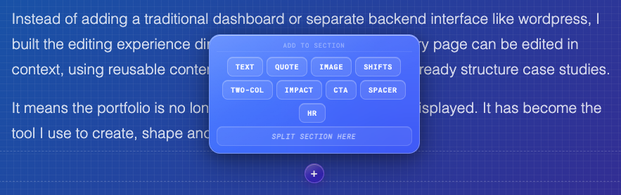
Instead of adding a traditional dashboard or separate backend interface like wordpress, I built the editing experience directly into the website itself. Every page can be edited in context, using reusable content blocks that match the way I already structure case studies.
It means the portfolio is no longer just a place where work is displayed. It has become the tool I use to create, shape and publish the work.
I didn’t want a CMS that felt separate from the thing I was designing. I wanted the page itself to become the editing surface.
Problem
My portfolio was becoming harder to maintain as the amount of work grew.
Each case study had slightly different content needs, but I still wanted them to feel consistent. Updating pages manually meant editing code, duplicating layouts, and spending too much time on page structure instead of the actual story.
A normal CMS would have solved some of this, but it also felt too heavy for what I needed. I didn’t want a detached admin dashboard, generic fields, or a rigid publishing flow that worked against the visual nature of the site.
Solution
I built a custom block-based CMS directly into the portfolio.
Instead of managing content somewhere else, I can enter edit mode on the page, select sections, update text, add new blocks, reorder content and apply changes in context.
The system uses predefined case study blocks such as text, quotes, images, two-column layouts, impact lists, shift diagrams and CTAs. This gives me enough structure to keep pages consistent, while still giving each case study room to tell a different story.
What I Built
The system is built around a simple idea: every case study should be made from reusable blocks that are easy to edit, rearrange and publish.
Rather than creating a full admin product, I kept the editing experience close to the content. When edit mode is active, each section exposes its own controls. I can open a modal, update the relevant fields, apply changes, and immediately see the result in the actual page layout.
This keeps the writing, design and publishing process in one place.
The main block types include:
- Hero blocks for the main case study introduction
- Text blocks for narrative sections
- Quote blocks for key statements and pull quotes
- Two-column blocks for problem and solution framing
- Shifts blocks for before and after comparisons
- Impact blocks for outcomes and results
- CTA blocks for closing actions or links
- Image sections for showing screenshots and visual proof
The result is a portfolio system that feels structured, but not locked down.
Core Features
- Inline editing directly on the live case study page
- Reusable block system for consistent storytelling
- Custom edit modals for each block type
- Rich text controls for formatting content
- Ability to add new sections without touching code
- Support for structured case study patterns like problem, solution, impact and shifts
- Cleaner publishing flow with less manual page building
- A portfolio that can scale as new work is added
Why inline editing mattered
A traditional CMS usually separates the editing experience from the final output. You write into fields, save changes, then preview the result somewhere else.
For this project, that felt wrong.
The whole point of a portfolio is storytelling, rhythm and visual flow. I wanted to make decisions while looking at the actual page, not inside a disconnected form.
Inline editing made the system feel more natural. It let me shape the case study in the same place someone will eventually read it.
Why blocks mattered
The block system gave the portfolio enough structure to stop every case study becoming a one-off build.
Each block has a clear purpose. A hero introduces the story. A two-column section frames the problem and solution. A shifts block shows transformation. An impact block captures outcomes.
This gives me a repeatable content model, but still enough flexibility to tell different types of stories depending on the work.
It is basically a small design system for case studies.
The biggest improvement was not just that the site became editable. It was that creating a case study started to feel like designing with a system.
Designing the editing experience
The editing experience needed to stay simple because I didn’t want the CMS to become a project bigger than the portfolio itself.
I focused on a few core interactions:
- Enter an editing mode.
- Select a block.
- Open a focused editing modal.
- Update the content.
- Apply changes.
- See the result immediately.
Each block has controls that match its content. The hero block has title, lead paragraph, external link and tags. Quote blocks have quote text, attribution and a large quote option. Two-column blocks split the content into left and right fields. Impact blocks allow multiple items to be managed as a list.
The important part is that the editing UI is not generic. It understands the type of content being edited, that makes the whole thing feel much more intentional.
Design considerations
I wanted the editing layer to feel useful without getting in the way of the portfolio experience.
That meant keeping the edit controls visible enough when I need them, but not letting them dominate the page. The editing modals are deliberately simple, with clear labels, straightforward controls and an obvious apply action.
The page behind the modal stays visible, which helps keep the editing process connected to the final design.
System considerations
The content model had to be flexible enough for different case studies, but structured enough that pages would still feel consistent.
That balance is handled through the block types. Each block has a defined shape, but the order and combination of blocks can change depending on the story.
This makes it easier to publish new work without rebuilding layouts from scratch.
Impact
- Reduced the effort needed to create and update new case studies
- Removed the need to manually edit code for every content change
- Created a reusable structure for future portfolio work
- Made the portfolio easier to maintain as the number of projects grows
- Improved the quality of storytelling by editing directly in context
- Turned the website into a proper personal publishing system
- Turned the website into a proper personal publishing system
- Turned the website into a proper personal publishing system
What I learned
This project made me think about my portfolio in a completely different way.
At first, the work looked like a website update. But the more I built, the more it became a design systems problem. I wasn’t just creating pages. I was creating reusable patterns, editing rules, content structures and publishing flows.
It also reminded me that tooling does not always need to be huge to be useful. A focused internal tool can be much more valuable than a complex system with every possible feature.
The best part is that the CMS now matches the way I actually work. I can write, design, edit and publish in one place.
That is exactly what I wanted from it.
This case study was built using the CMS itself.
The system is now ready to support more case studies, faster updates and a much more flexible way of publishing work.
Explore more work